Okay so here's a weird thing. You have probably owned, I don't know, fifty graphic tees in your life? Maybe more. You wore one yesterday. I wore one yesterday. But if somebody put you on the spot and said "define graphic tee," you'd just... stall. Mumble something about a shirt with a picture. Which, fine. That's close enough for casual conversation. But a graphic tee shirt is actually doing a lot more than most people stop to think about, and I think it deserves a slightly better answer than that.
So what is a graphic tee? Really, actually, if we're being specific about it. A graphic t shirt is any tee that has some kind of visual design on it. Could be an illustration, a photograph, typography, abstract artwork, whatever. Printed on, pressed on, dyed into the fabric. That's the graphic tee definition boiled down. A band logo counts. A full-body cosmic painting that wraps around the back counts. Three words in a bizarre font that somehow communicates your entire personality to strangers... also counts. The bar is honestly lower than people think.
What Counts as a Graphic Tee?
People ask this way more than you'd expect. Like, what counts as a graphic tee versus just a regular printed shirt? Where's the line? It's blurry. I get it. A plain white tee with a tiny pocket logo, that's not really a graphic tee in most people's minds. But a shirt absolutely covered in hand-drawn skulls and cosmic artwork? Yeah, obviously.
Here's how I think about it. If the design is the reason you bought the shirt (not the brand name, not the fit, the actual visual), it's a graphic tee. The art IS the point. You're wearing a statement. A vibe. Not just cotton.
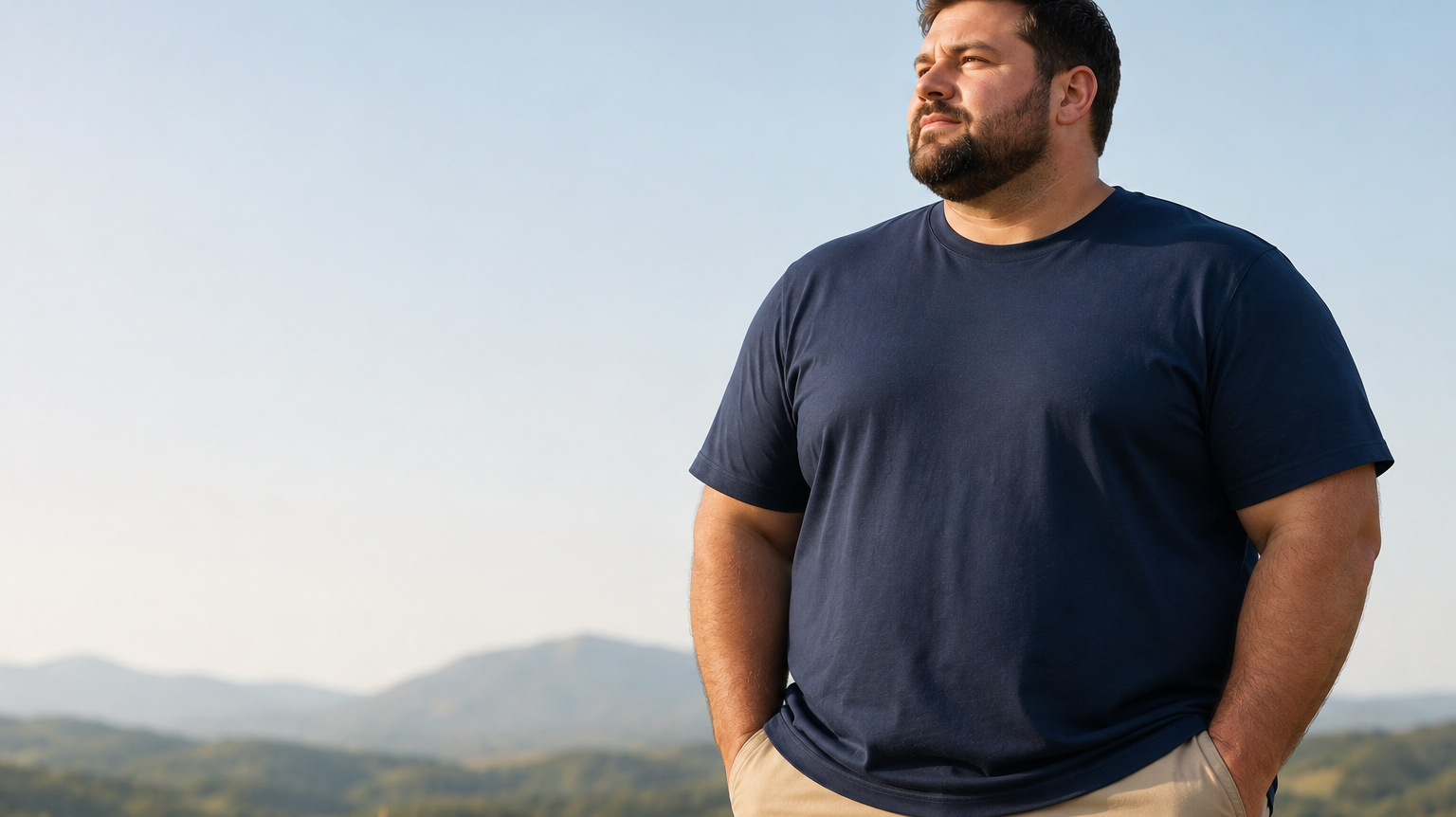
Nobody walks into a store looking at graphic tees for men because they're cold and need something on their torso. Come on. They buy it because the design caught their eye from across the room. Period.
A Quick (and Surprisingly Weird) History of Graphic Tees
The graphic tee history goes further back than you'd guess and honestly it's kind of a strange ride. T-shirts as a standalone garment didn't even exist until the early 1900s. Before that they were underwear. Like literally just undershirts that soldiers and laborers wore under their actual clothes. Nobody was screen printing galaxy designs onto their long johns in 1910, I promise you that.
First real graphic tees popped up in the 1940s and 50s. Campaign slogans mostly. Military stuff. Souvenir prints from tourist traps (you know the type). Pretty unremarkable. Then the 60s and 70s hit and the whole thing just, I don't know, exploded. Tie-dye everywhere. Band merch became a thing. Political statements. My dad still has a box of concert tees from that era in the garage and refuses to throw them out. Suddenly your t-shirt wasn't clothing anymore, it was a billboard. A personality test that people could read from ten feet away.
By the 80s and 90s? Forget about it. Skateboard brands, hip-hop labels, every pop culture reference imaginable. And now the graphic t shirt meaning has gotten way more layered. You've got limited-edition artist collaborations, premium fabrics nobody would've used on a tee twenty years ago, all-over prints that genuinely look like wearable paintings. The bar keeps moving and that's honestly a good thing.
Different Types of Graphic Tees (and Why the Print Method Matters)
Not all graphic tees are the same. Not even in the same ballpark sometimes. The way a design gets onto the fabric changes everything about how it looks, how it feels in your hand, and whether it still looks decent after thirty washes. Here's the breakdown of the main types of graphic tees by printing method, because this stuff actually matters more than most people realize.
Screen Printed Tees
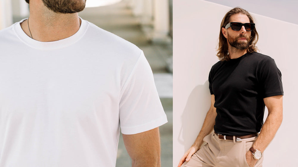
The OG. Screen printing pushes ink through a mesh stencil right onto the shirt, one color at a time, layer by layer. Been around forever. Still produces some of the most vibrant, durable results you'll find anywhere. The ink sits on top of the fabric so if you run your fingers across the design you can feel it slightly raised. I wore a screen printed tee to a barbecue last weekend and someone asked if it was embroidered. It's not. But that's how tactile a good screen print can be.
Downside though? It works best with simpler designs. Fewer colors. If you wanted a photorealistic full-color image you'd need dozens of individual screens which gets expensive and kind of impractical. But for bold logos and typographic stuff and limited-palette artwork, screen printing is still really hard to beat.
Dye Sublimation (All-Over Prints)
Okay this is where it gets cool. Dye sublimation uses heat to literally turn ink into gas (I know, sounds fake) and that gas bonds permanently with the polyester fibers in the fabric. What you end up with is full-color, edge-to-edge prints that don't crack. Don't peel. Don't fade. Ever. The design becomes part of the shirt at basically a molecular level. It's not sitting on top of anything.
You know those galaxy shirts with the insanely detailed cosmic all-over prints? That's sublimation. INTO THE AM uses this method for a ton of their mens graphic tees and honestly the difference is obvious the second you pick one up. No stiffness where the print is. No weird rubbery texture. Just soft fabric that happens to look absolutely wild. I keep reaching for mine over shirts that cost twice as much. Says a lot.
Direct-to-Garment (DTG)
Think of DTG as basically a giant inkjet printer but for shirts. It sprays water-based ink directly onto the fabric and can handle extremely detailed full-color images. Great for complex artwork, small production runs, that sort of thing. The hand feel is softer than screen printing because the ink soaks into the fibers instead of sitting on the surface.
Tradeoff is longevity. DTG prints can fade quicker if you're rough with them in the wash. Cold water, turn them inside out, hang dry if you can be bothered. Still solid quality. Just needs a little more babying than some other methods.
Heat Transfer and Vinyl
Cheapest route by far. This is what you get with fast-fashion graphic tees and those custom one-off shirts from mall kiosks where they put your face on a mug. A design gets printed onto transfer paper then heat-pressed onto the fabric. And look, it works. Sort of. But the print feels plasticky, starts cracking after like four washes, and peels at the edges in a way that just looks sad.
Worth it for a joke shirt you'll wear to one party? Sure, whatever. For something you actually want in your regular rotation? Nope. Hard pass.
Graphic Tee vs Regular Tee: What's Actually Different?
Beyond the obvious (design versus no design), the graphic tee vs regular tee thing actually goes deeper than you'd think.
A plain t shirt is a foundation piece. Versatile. Understated. Works under a jacket, works on its own, works with basically anything. It's the supporting actor in your outfit. A graphic tee is the lead. It sets the tone for everything else you're wearing before you even say a word to anyone. Completely different energy and I don't think enough people appreciate that distinction.
There's a construction thing too, at least with higher-end brands. Premium graphic tees tend to use heavier or more specialized fabrics to make the print look right. INTO THE AM's 4.2 oz cotton-poly blend, for example, they specifically chose it because it holds sublimation dye beautifully while still being soft and breathable. Meanwhile a lot of basic tees use 100% cotton which is totally fine for a blank canvas but doesn't always cooperate with certain printing techniques. I learned this the hard way buying a cheap all-over print that basically disintegrated after a few months. Anyway.
Can you love both? Obviously. Your wardrobe needs both. That's kind of the whole point.
What Makes a Good Graphic Tee (and Why Most Are Mediocre)
Here's my honest take and I'm going to be a little blunt about it. Probably 90% of graphic tees out there are just... forgettable. Mass-produced designs that you've seen variations of a thousand times. Scratchy prints. Boxy fits that make every single person look like a cardboard box regardless of body type. The remaining 10% are the ones you reach for over and over until they're practically worn through. So what's different about that 10%?
The Fabric
Everything starts here and I will die on this hill. A graphic tee with the most amazing design in the world on garbage fabric is still a garbage shirt. Full stop. You want something that drapes well, feels soft on your skin, doesn't shrink into a crop top after two washes (we've all been there). Cotton-poly blends tend to nail the sweet spot, you get the softness of cotton with the durability and shape retention of polyester. Pure cotton people might come at me for that take but honestly I've watched too many 100% cotton tees turn into dishcloths after a year to care. Fair enough if you disagree.
Print Quality
Run your fingers across the print. Can you really feel it sitting on top there, thick and kind of rubbery? Bad sign. That's a sticker, not a print. Good quality means the design integrates with the fabric instead of just camping on top of it. The best graphic tees use methods like sublimation or high-quality screen printing where the artwork doesn't compromise how the shirt actually feels to wear.
And look, durability matters just as much as first impressions here. Maybe more. That print has to survive dozens of wash cycles without cracking or fading or peeling up at the corners. INTO THE AM's prints don't crack because the dye sublimation process bonds the ink into the fabric permanently. It's genuinely not going anywhere. I have one from like two years ago that still looks brand new which, considering how I treat my laundry, is saying something.
The Fit
Massively underrated factor. Like hugely. A graphic tee in an oversized boxy cut looks completely different from the same exact design on a tailored athletic fit. Neither approach is wrong (oversized definitely has its place, I'm not here to argue that), but the fit should be a deliberate choice. Not just "we cut this in a rectangle shape and called it a shirt."
INTO THE AM goes with a tailored, athletic fit. Slightly tapered through the torso. Not tight, not drowning in extra fabric. It flatters the body instead of hiding it. Which seems like an obvious thing for a t-shirt brand to aim for but you'd be surprised how many don't bother.
The Artwork
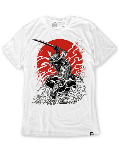
Should go without saying but I'll say it anyway. The design itself matters. A lot. Hand-drawn original artwork from actual living breathing artists hits completely different than generic clip art or, and I cannot stress this enough, AI-generated filler that all kind of looks the same after a while. There's a soul to hand-drawn work. You can feel the intent behind it. INTO THE AM commissions real artists for their designs and it shows. The nature shirts and skull graphic tees aren't pulled from some stock image library. They're created specifically for the brand. So you're not going to see the exact same wolf howling at the moon on ten other websites. That matters to me. Maybe I'm weird about it.
How to Style Graphic Tees (Without Looking Like You Gave Up)
Styling graphic tees seems like it should be obvious but then you actually stand in front of your closet and realize some combinations work effortlessly while others make you look like you got dressed during an earthquake. In the dark. I've been both of those people in the same week so trust me, a little thought goes a long way here.
The Casual Go-To
Graphic tee, well-fitted jeans (dark wash or black work best), clean sneakers. That's it. This works 95% of the time because the tee is doing all the heavy lifting while everything else stays neutral. Don't overthink it. Don't add a statement necklace. Don't layer three patterns. Just let the shirt be the shirt.
Layered and Elevated
Throw a bomber jacket or a flannel or an open button-down over a graphic tee and suddenly the whole thing looks intentional. Thought out. The graphic peeks through just enough to add some personality without taking over the entire outfit. This works especially well with darker or more subtle designs. And in warmer weather you can swap the tee for a graphic tank top under an open short-sleeve shirt for the same vibe but way less heat. I did this at a friend's rooftop thing last July and got genuinely asked if I had a stylist. I do not have a stylist. I just read the internet too much.
Streetwear Edge
Oversized graphic tee with cargo pants or joggers. Chunky shoes. Maybe a beanie if it's that kind of day. This is the skate and streetwear lane and it's all about playing with proportions. The tee should be the loudest piece and everything else just supports it. Bold all-over prints work particularly well here because the extra fabric gives the design more canvas to breathe on. Point being, if you're going loud, commit to it.
Shorts Season
Graphic tee and chino shorts. Summer uniform. There's a reason everyone defaults to this combo and the reason is that it works. Keep the shorts relatively fitted, tuck or half-tuck the tee if you're feeling adventurous. Tank tops for men are also totally fair game once the temperature climbs past the point of reason which, where I live, happens by like May.
One universal rule though? Let the graphic tee be the star of the outfit. If your shirt has a loud detailed print then keep accessories and other statement pieces minimal. Two loud things fighting for attention is just visual noise and nobody wins. Including you.
Where to Buy Graphic Tees That Actually Last
Okay I'm going to be upfront here. I think INTO THE AM makes some of the best graphic tees on the market right now. Especially if you care about print quality and original artwork, which I clearly do based on the last two thousand words. Their dye-sublimation prints are genuinely unmatched at the price point. The fabric feels premium without the premium markup. And the artist collaborations produce stuff you literally cannot find anywhere else. Bias acknowledged. Moving on.
But let me talk about the broader landscape of where to buy graphic tees because it's worth understanding your options.
Fast fashion brands. H&M, Zara, Forever 21, you know the crew. They'll always have the cheapest options and they will always feel like the cheapest options. Prints crack. Fabric pills. They end up in a landfill or a donation bin within a year. Here's the math though, for the same price as two throwaway tees from a fast fashion brand, you could get one from INTO THE AM that'll still look good three years later. I'm not great at math but even I can figure that one out.
Vintage shops and thrift stores are amazing for one-of-a-kind finds. Especially vintage graphic tees with that perfectly worn-in softness that you can't replicate. The treasure hunt is genuinely half the fun. Just know going in that sizing is wildly inconsistent and whatever print survived this long has already been through god knows how many wash cycles. You're rolling the dice a little. Which is part of the charm I guess.
Streetwear brands like Supreme, Stussy, BAPE, those guys charge a real premium and some of it is for the design but a lot of it is for the name on the tag. If brand cachet is important to you that's a perfectly valid reason to pay more. No judgment. But if you just want incredible original artwork on a quality shirt you do not need to be spending $80 or more.
INTO THE AM kind of sits in this sweet spot that's hard to argue against. Premium graphic tees with original hand-drawn artwork. Print methods that genuinely do not degrade. An athletic fit that actually flatters instead of hiding. And free shipping when you spend over $100, which, if you're stocking up, adds up fast in savings. Their graphic tee packs are solid for exactly that and the t shirt subscription is worth looking into if you like getting surprised with new exclusive designs monthly.
The Bottom Line on Graphic Tees
So. What is a graphic t shirt? Honestly it's self-expression sewn into fabric. Simplest way to tell the world what you're into without opening your mouth. It's a $25-40 piece of clothing that can anchor a whole outfit or start a conversation with a complete stranger at a coffee shop. I've had both happen. Multiple times.
But not every graphic tee earns a spot in your rotation. Life is genuinely too short for prints that crack after five washes, fits that make you look like you're wearing a paper bag, and designs that look like they were cranked out by an algorithm in ten seconds. Find brands that work with real artists. That use fabrics you actually want against your skin. That pick printing methods built to last. Your closet will be better for it and honestly so will your mornings when you're standing there trying to pick a shirt.
Ready to move on from whatever you've been settling for? Browse INTO THE AM's full collection of graphic tees for men and see what different types of graphic tees look like when a brand actually puts in the effort to get them right.